
Class Log 02-26
Dailies today consisted mostly of environment designs for hero assets and layout blocking from the SDGM crew. There were some character designs and storyboards, but the bulk of our time was committed to discussing how to populate the world's assets. It was a packed day, so there is a lot to go over.


We started by looking over an updated version of the docks, and the neutral rocks work much better. Wei shared a concept painting with us for the dress shop scene to see how we felt about putting trees in the middle of the road. The group consensus was that they would feel too out of place in such a small Italian town. Kang provided some drawings of classroom assets, including the blackboard and the bookshelf. They were both received well and are ready for modeling. Shannon showed a painting of the paper in the alleyway, and I suggested that it be cooler colors to match the mood. This raised the discussion of doing the color script, which Shannon is going to do next. I think this will be key, since the arc of our film will emotionally be revealed through the colors.
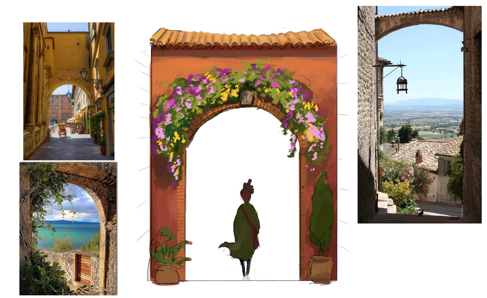
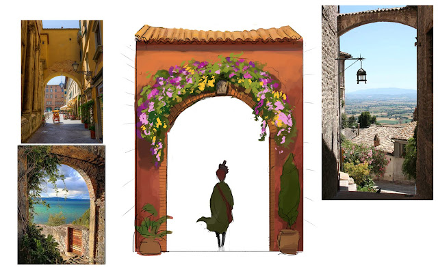
I focused on providing hilltop assets to help Addie complete that section. I explored the initial archway Phoebe walks through, considering the materials and the construction of it relative to the buildings around it. Although it needed to be rustic, I really wanted this to feel festive and iconic, since it is part of the shot that leads to our title reveal. I put a keystone with a butterfly on it as a call-back to our theme, but the crew decided it would be too unrealistic. They really liked the Bougainvillea flowers and the color scheme though. Since this was such a key piece, I went ahead and dressed it with some color and texture to keep the discussion moving forward. Dennis suggested moving the roof up some so it matches his storyboard a bit more. He was also imagining it as a bridge, but that was not intended in the design. We decided to keep it a narrow wall, but I will try raising the roof a little bit. I threw a quick drawing of Phoebe in as well for scale and a sense of the story beat. I could easily see something like this being an effective poster for the film. That might give away our big reveal though.

I designed the bench based on photos reference, but I modified the metal design of the supports to have a slight botanical motif to match our themes a little better.

Addie asked for some clarity on the church doorway over the weekend, so I gathered some references and designed a door that I thought represented that moment well. Ultimately, it ended up being too complex for the amount of screen time it would get, but it could possible be reused later. It also prompted a texturing discussion about reflective metal surfaces, so that was a good thing to bring up.

Addie also asked about the relief sculpture above the church doors, and I modified the photo reference with a new sketch to give some direction. This unexpectedly prompted a discussion about who would be the modeler of these types of sculptures. Kyle is our organic modeler, so it would probably fall on him to handle the anatomy. We realized, however, that we could reuse the background character asset and cover it with a robe. It also raised the question of putting reliefs in other areas of the film. Some of the crew were worried about water or other effects being too heavy, but Tim told us not to care about those limitations.

I also shared some photo options of easels for the artists at the hilltop, and the art directors decided to go with the right one. It is what most people will think of when you say easel, and it would be large enough to be seen on camera.

I redesigned the fountain for the hilltop so that it would be simpler and more medieval in time-period than the one in the festival piazza. I made it a little bit too simple though, because our artists are supposed to be painting it. We decided to put a small figure on top of the fountain to give it some interest and charm.
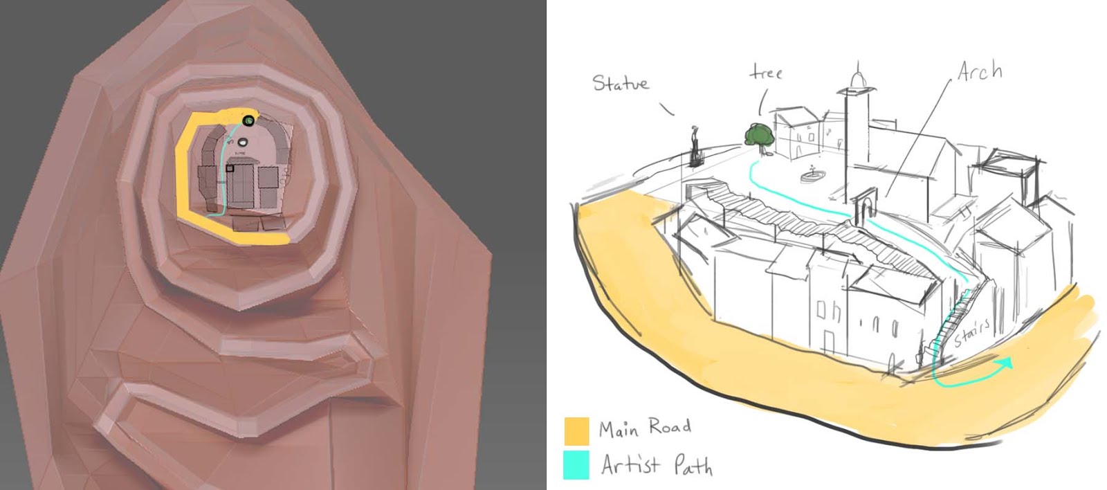
I also showed a hilltop drawing I did that explained the connection of the artist's path to the main road. Kyle pointed out there was some disconnect between the boards and the development drawings, which I agreed needed more clarity. The art directors approved it and we moved forward.


Finally, I showed some tree designs for where the artist is sitting. It is our first show, and I thought its shape would be important for our initial impression. We have to grab the audience early or they will check out. The crew ended up liking the third tree's silhouette, but with the lighter colors and flowers of the first tree.
We also saw some mural progress from Shannon, which was helpful for discussing more texture considerations. Jiazshen did a nice painting of the squirrel scene, showing the Paperson flying through the air. The crew noted that they liked the cool colors, and I agree. I did think the road was a little too even for that section of cobblestone, but the ground needs to be explored in depth anyway. Emily provided some paintings of the artist and the paper in the classroom, which we had not explored any yet in color. It was cool to see the resolution of our film taking shape. Shannon created some dancers for the festival and designed some vendors and Vespas as well.
Digi-Scout did a great job doing layout and modeling for this section. Austin's treatment of the Hilltop sequence was great for trouble-shooting the shot language, and I think it's in a good spot. We consolidated some shots to try and keep the time down. It was already at a minute of runtime, and even with the edits it will be too long for our intended goal. It also helped Addie to see where to focus her efforts. It showed me that it's important to know what will be in the shot, because it's possible that a lot of your design work will not even be on camera. There was also some discussion of rigging and hands on the background characters. Rebecca showed us some updated textures, and they look great! The buildings are nice and sharp, and the chairs have slight displacement on them to look like paint strokes.
Character Crew mostly showed some turnarounds and some exploration of the kids from the end. Shannon also showed how the Seagull's wings work for rigging purposes. Dennis showed the artist with her hair down, but the crew thought it needed more exploration.
Gabi's boards were a step in the right direction for the festival scene. There is still some confusion over the best way to show that major decision. Tim mentioned that it was stronger having the paper hit the artist, and I agree. It moves the pace along very quickly, which is what we need at this point. I think there still needs to be more exploration of that sequence to get it perfect, since the whole film hinges on its success. Dennis and I were talking after class that it could be good to have a closer moment with some character acting between the paper and the artist, and then pull out to show the decision but wipe the screen with the crowd before you see what happens. If we had to, I think it would be completely fine to just have a micro-conclusion within the festival. Suspense is good to shoot for, but if we can't find a good way to express it then we should just go for short and sweet.
Comments
Post a Comment