Posts

Class Log 03-12

Image
Today's class was a scattershot of different assets getting completed. It feels good to see everything coming together! Dennis detailed Phoebe's hair, and we all agreed some more irregularity would be good to avoid it looking like sausages. Ana has been developing Paperson's hair as well, which has been really good for the 2d animators. We got some suggestions from them on Friday about what would be manageable. I think the mixture of 2d and 3d is going to be one of my favorite aspects of this production.  Addie modeled out some great terra-cotta roofs. We discussed how those worked exactly and got some good references for her.  Kyle modeled the gallery, and we discussed how the stairs could be potential problem for screen direction. I suggested that the stairs be pushed into the building and that we use a recessed doorway. That way we can have the stairs and keep the whole thing simple. Kyle's model segued perfectly with me creating the design for the gallery win

Class Log 03-09

Image
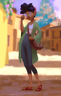
Today's class was the big reveal of my color paintings for Phoebe. I did three version of her in different lighting so that the texture artists could see what effects we were going for. Sunny was surprised that it was a painting, which was a win in my book. I think this was a really helpful piece to create because it gave everyone some ideas about what the final look could be. It included more helpful information than is on the surface: the use of brush strokes, the out of focus background, Phoebe's relationship to background characters. Also of note are the new sandals and short leggings. These were some of the changes the art directors requested, in addition to tweaking the color of the headband to be a little more vibrant. It was wonderful to work in this pipeline. I got to move back and forth with Dennis and Ana with the character design. Then, working on top of a finished drawing by Dennis, I was able to bring it to a finish. I incorporated Shannon's backgrounds in

Class Log 03-07

I was not able to attend today's class, but I was told by Dennis that substantial areas have been cut from the film. I am not surprised to hear this, and I understand that it is how things go in the collaborative business. Ultimately, all of the work has pushed the team forward and helped us to understand the character and our world. There will be plenty of art for the concept art book, that is for sure! Things that have been cut include: The Cat, which means the paper is blown by the wind like we originally planned The Musician, although the mural is still there for the drawing to collide with. The Seagull scene, our character simply walks straight tot the dress shop The Alleyway scene, including all the reaction shots The Dancers, which led to the artist being motivated by seeing the paper, which is stronger The Classroom, which means our grand finale needs to happen at the festival Ultimately I think this results in a much tighter and stronger story. The other el

Class Log 03-05

Image
Friday we met with the animation crew to show them the storyboards and hear their thoughts. Gabi and Haley team-tagged the presentation and did a great job. The animators were worried about how big the film was, and we went back and forth about it some. They also asked some technical questions about the rigs and process of animating that were helpful to the digi-scout crew. We split up in to groups so the animators could discuss the film. Rebecca had some textures to show us, and we worked on developing the look for Phoebe's hair. We also got to meet Tia, who is helping us develop the Z-brush model of Phoebe. Today we continued developing assets and layout shots for the film. I have been lent over to characters, and am continuing to develop a Phoebe painting for our modeling crew.  Environments had some great hero assets for boats, the dock, trash and rock walls. There was also some nice brickwork done by Jiazhen, which should be helpful for modeling to make tileable texture

Class Log 02-28

Image
Today's class involved some final storyboard tweaks and more asset reviews. We are in full-swing modeling now, and our deadline is fast approaching. The first major story discussion was about the final scene in the festival. Gabi did a great job injecting some sincere character moments into that scene, which lined up with my thoughts. The only thing I thought needed a tweak was how it transitions into the scene of darkness. I suggested we pull out wider so the crowd could wipe the screen for an elegant transition. My suggestion was interpreted as an aerial shot, but Dennis explained it better to the group and it got approved. He and I came up with the idea while driving home from the last class, and I'm glad it resonated with the crew. Character Crew brought us some more hair styles for Phoebe, along with some drawings of the Paperson. Dennis provided some nice options for the artist's hair, and we settled on an asymmetrical look. Ana did some nice gestural studies for

Class Log 02-26

Image
Dailies today consisted mostly of environment designs for hero assets and layout blocking from the SDGM crew. There were some character designs and storyboards, but the bulk of our time was committed to discussing how to populate the world's assets. It was a packed day, so there is a lot to go over. We started by looking over an updated version of the docks, and the neutral rocks work much better. Wei shared a concept painting with us for the dress shop scene to see how we felt about putting trees in the middle of the road. The group consensus was that they would feel too out of place in such a small Italian town. Kang provided some drawings of classroom assets, including the blackboard and the bookshelf. They were both received well and are ready for modeling. Shannon showed a painting of the paper in the alleyway, and I suggested that it be cooler colors to match the mood. This raised the discussion of doing the color script, which Shannon is going to do next. I think this wil

Class Log 02-21

Image
Today we began by looking at boards. Wei did a great job on his version of the Dress Shop sequence. One major thing we all liked was the paper falling off of the trash can in defeat. Ultimately, it got moved for the sake of the story, but it was an important tonal note that we used for our later discussion. That discussion was about how far we should delay the paper's feeling of conclusion. Sarah brought up a great point that the paper is feeling good before the classroom, and it would be better to put that off so that we don't know what to expect going to the final scene. This tied in very well with the paper being put in the bag, and people suggested that we could have the artist choose between throwing away the paper or putting it in her bag. This was a much-needed change so that the story has a more complete arc to it. Gabi and Dennis are going to be smoothing out that idea as time goes on. Gabi also showed us a new version of 800 where the paper has left the artis

Class Log 02-19

Today we reviewed the work from the weekend. We made some tweaks to the boards of the festival and classroom, and we discussed some character designs for the side characters. Emily created some boards for the transition between the festival and the classroom. She had it start with darkness, then light comes in as the bag is opened, which was a really nice touch. For character designs, we looked at that had been created by Anne for the cat (code named Garbage Boy), and we agreed that the design was a little more TV animation than it was feature. Shannon said she would go over the design and develop it further. We also looked over some designs for the guitarist by Anne and discussed whether he should have a hat or not.  The reality of him needing hands became a thing too, since he is playing guitar and all. Then the art directors decided that all the background characters need handed, at least basic ones. I think this is a good call because you never know what may come into focus.

Class Log 02-14

Today's class featured more development on the color images and the main character's design. I altered my storyboard sequence to include multiple camera angles for the character heading into the alleyway. Chris said that was a great idea because it provided the CG crew with options, and they can choose what they want when the time comes. Storyboards are almost done, which is good. We are going to re-board the sequences of the classroom, and I think the festival could use another pass. The character crew showed us a final design influenced by Webber's notes, and Dennis was selected as the final person to develop the character's expressions and details. Kang provided us with a layered model render, which will help a lot with doing some paint-overs. At the end of class, we discussed what was due next week and what still needed to be locked down. Chris told the Environments team we need to pull together assets into packages that we can give modeling so they can set

Class Log 02-12

Image
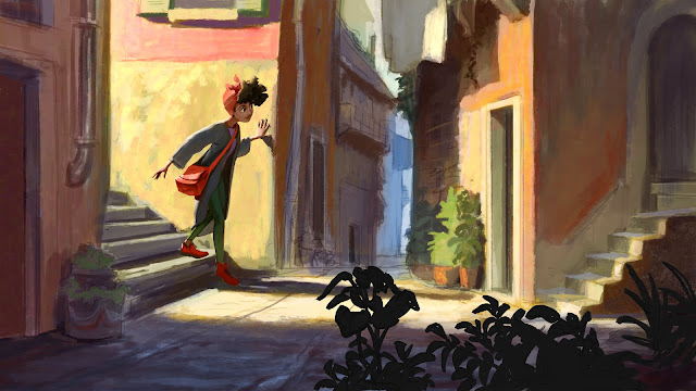
Today's class was mostly development on Analogue. There was a quick note on the location for the Office still being determined for Writer's Block, but that was all we had updates on. We started by looking through the environments. We compared some of Shannons scenes to mine in regards to establishing the mood of the girl's journey. Should she be lonely and isolated, like on the edge of the mountain, or curious and playful like in my alleyway piece? The crew liked the spiral motif on Shannon's mountain, so we will be moving forward with that design. Several people said they would like to see it have a more consistent angle heading downwards, since it flattened out along  the bottom area. I would definitely like to see there still be a cliff-face for her to walk alongside. For my piece with the alleyway, it was very well received. People said it looked quiet but not sketchy, and someone said they could just hear the noises, which was a really cool reaction. Chris told

Class Log 02-09

Image
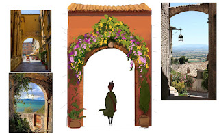
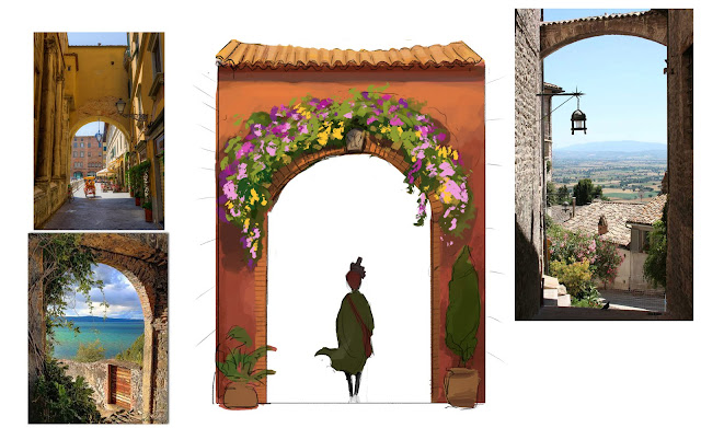
Today's class was full of great developments for Analogue! We discussed the flowers scattered throughout the city. Anne gave a rundown on how the flower Bougainvillea would inform our town. It means "paper flower," and it is common in the mediterranean. We decided to use this to name our town Bougainville, and to have flowers everywhere. They come in all sorts of colors, which is perfect for the festive environment. For characters, we offered feedback to the crew about how the proportions of the main character needed to line up with the background characters. They made some quick modifications mid-class and we approved them. The character crew also showed us some clothing options for background characters, which was exciting! I shared my modular approach to building structures, and I am planning to keep pushing more ideas forward for smaller pieces of the puzzle.   Since I was the one who developed the courtyard, I also did a rough sketch of the overall sho

Class Log 02-05

Image
Today's class brought the whole production together. We got our new draft of the script, and Emma did a wonderful job adapting the last version to the new location. We also reviewed the environment assets and some designs shots of our main character. Our digi-scout team explored more camera options, and we also had a visit by a Disney layout artist, Tyler Kupferer. The new script adjusted some aspects of the story. The most important was the way the character moves. Before, we had it being blown around by the wind a lot, but Emma has changed this to be the character walking around. The paper has agency and can move the paper like its own body. Many of the trails the character faced have been adjusted into interactions with the world. For instance, instead of the wind blowing it around, a seagull grabs the paper and flies away. The gags have made the whole story a lot more comedic, which will be good for the positive tone. The environments team provided some more color paintings